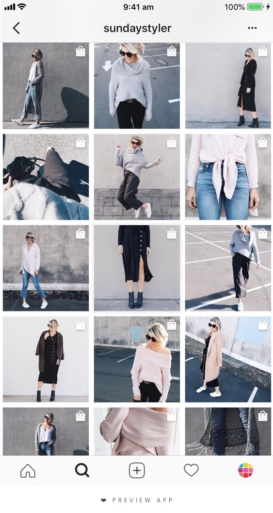
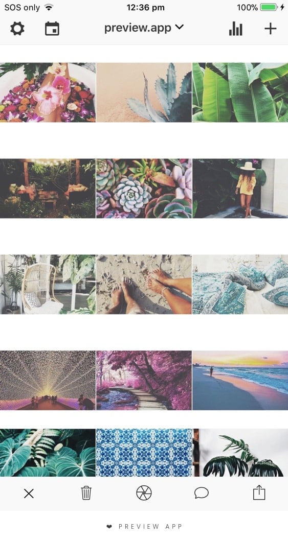
Your feed is your business card and the face of your business. Behind every face, there is a personality. Your Instagram theme is that personality. Which is why it is important to get that right.
In this article, I’ll tell you:
- Which Instagram layout you can use
- How to rearrange your Instagram photos to make a theme
- And some super simple – but SUPER IMPORTANT – tricks
If you apply these tips, I guarantee you will see a difference.
Let’s get started!
1. Choose a grid layout
What is a grid layout?
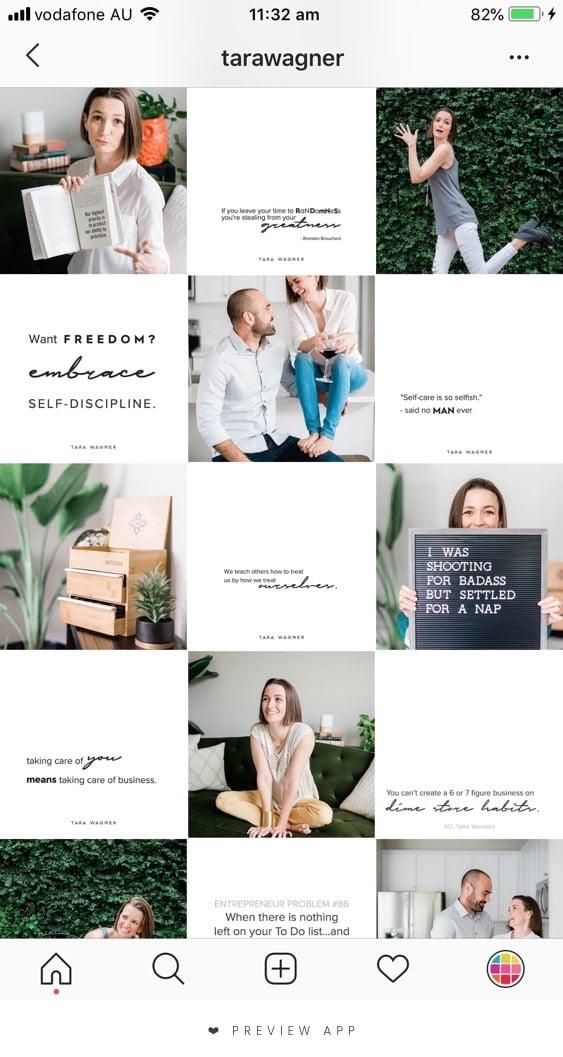
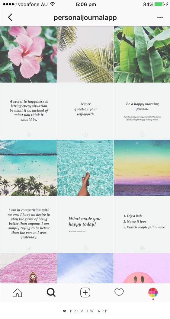
A grid layout is how your posts are positioned in your feed. It helps you know what photo to put next to another photo. A layout makes it easy to start (and stick to) a consistent Instagram theme.
There are 9 types of Instagram grid layouts you can create. I went into details about each one in this article.
Here are 2 layout examples from people who use Preview app to plan their feeds:
2. Choose a theme
Call it vibe, mood, soul. An Instagram theme is what your Instagram feed looks overall.
It is your visual personality.
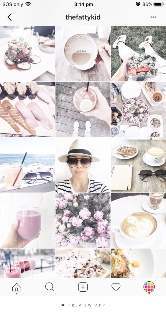
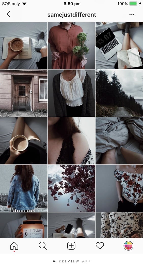
So what do you want your theme to be? Grunge, moody, boho, tropical, colorful, minimal or white?
Here is some more inspiration from our Preview app community:
- @thefattykid: White
- @samejustdifferent: Dark
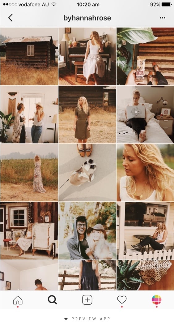
- @byhannahrose: Vintage and orange
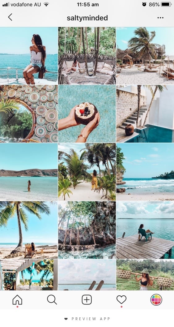
- @saltyminded: Tropical
3. Choose what you want to post about
A theme is not just about the colors in your photos. It is also about what you post and talk about.
This is an optional step.
But if you are a blogger or a business owner, I strongly recommend you think about what you are the most passionate about and what you want your Instagram to be known for.
Look at our favorite Instagrammers right now. Most of them usually talk about the same topics all the time. They talk about what they are passionate about and this is why you are following them. These topics make people want to come back for more.
So what are you passionate about? Pick a few things you absolutely love (between 1 to 5 things). And then post about these things all the time. This is your content, your story, your theme. Don’t be afraid to let your personality shine.
Examples:
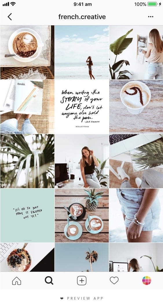
- @french.creative: Palm trees, coffee, quotes
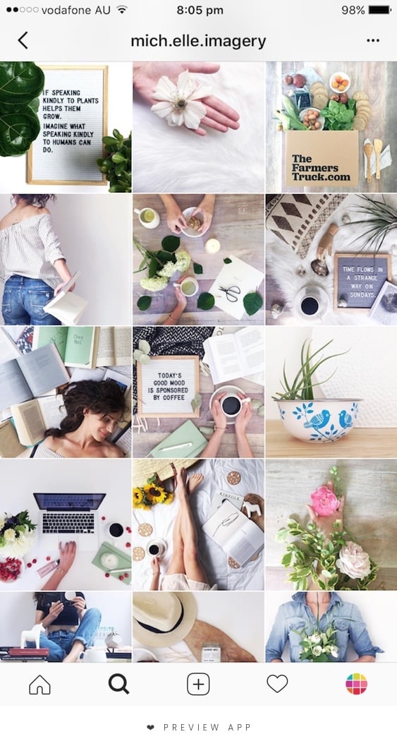
- @mich.elle.imagery: Books, coffee, nature
4. Pick ONE filter and stick to it
A theme is nothing without a filter.
Using the same filter on your photos, all the time, is the easiest way to start a theme.
Where to find filters to make a theme? There are many different Filter Collections in Preview app: White, Fall, Dark, Colorful, Pastel, and more… Pick a filter and stick to it.
Look how consistent a feed looks like when you use the same filter on all the photos all the time:
5. Rearrange the order of your posts to make your feed flow
At this stage, you have a layout in mind.
You know what you want your overall theme to look like.
You know what you want to post about.
And you have a filter.
Perfect!
Your theme is starting to look really good!
Now, you need to make it flow.
Why do some Instagram accounts look SO good?
They look SO good because they know which photos look nice next to each other.
The trick is to rearrange the order of your posts to make your overall feed flow.
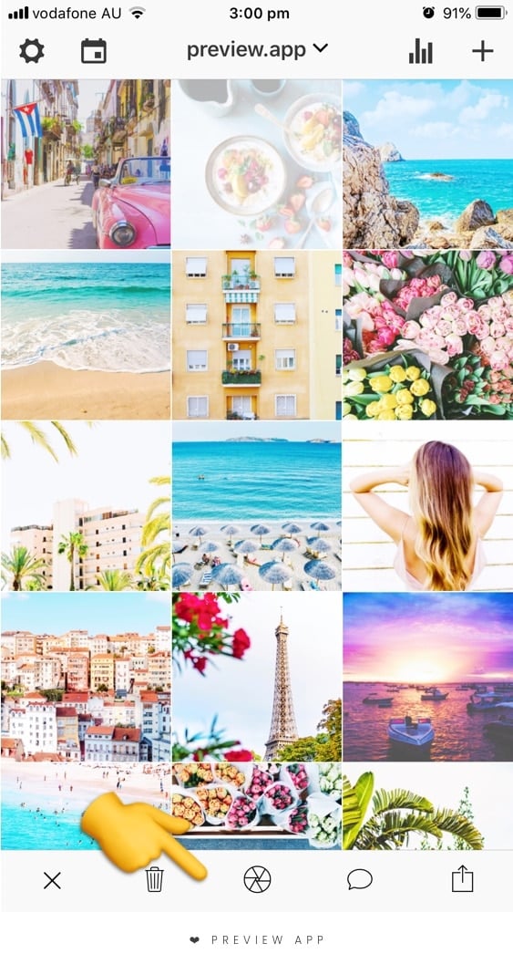
It can be hard trying to guess what photos you should post to make your overall feed flow. This is when Preview app comes very handy.
You can use your Preview app to rearrange the order of posts, and see what your Instagram feed will look like before you post on Instagram. Just upload your photos / videos / albums in the app, and drag and drop them to move them around. If a photo doesn’t fit, just delete it from your Preview feed.
Ok, but which photo should I put next to each other?
Take your time to move your photos around until you are happy with the overall look of your feed. If you are using a grid layout, it will be easy to know what to post and when. For example, if you are doing a tiles layout, you know you will have to alternate between a quote and a photo. Easy.
If you are not using a specific grid layout, your goal is to balance your feed.
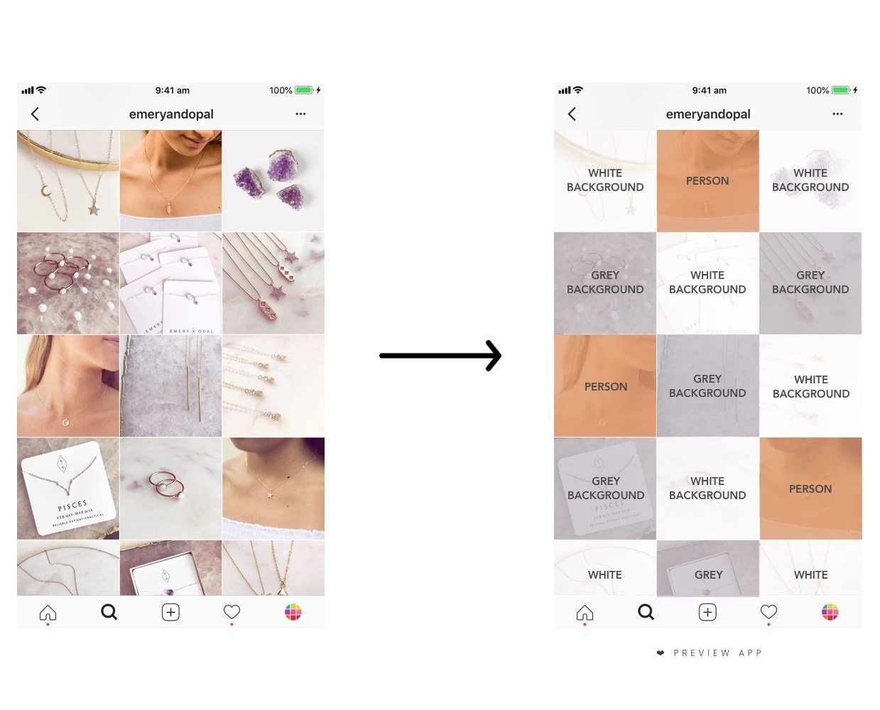
To balance the look of your feed, space out your photos based on the colors in them, or even the subject or background. Generally, people avoid putting photos that are too similar next to each other. They space them out. By spacing out photos that are too similar, they create contrast between each post. This will make your overall feed look balanced.
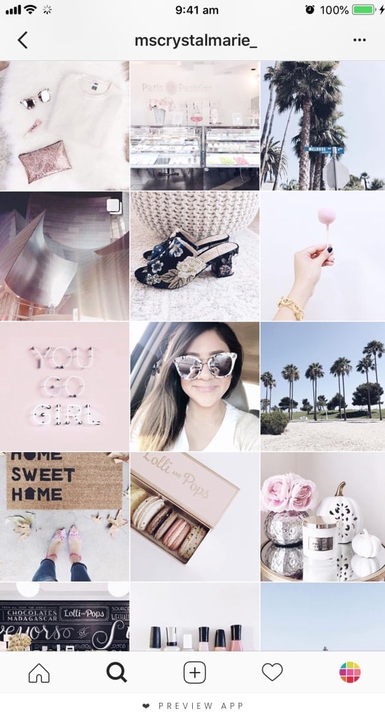
Here is an example from someone who uses Preview. Can you see how she spaces out her photos?
6. Color coordinate
One level up. Color coordinate your photos.
To color coordinate:
- Pick 2-3 colors you know you will always use in your photos
- Then space out your photos in your grid to balance your theme
Examples:
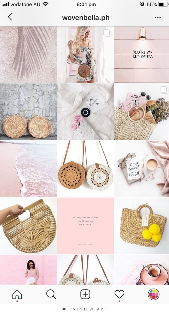
- @wovenbella.ph: Pink, white and brown (from the bags)
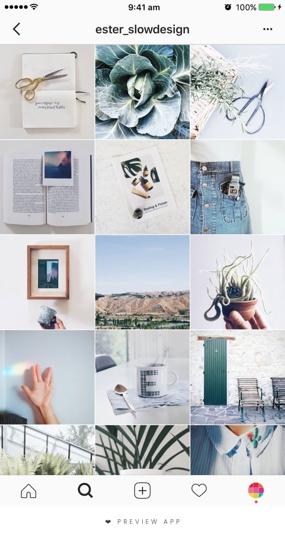
- @esterslowdesign: Blue, green and white
7. Always check the background of your photos
This simple tip will transform your feed: Pay attention to the background of your photos and quotes. Keep it clean.
Don’t let the background distract from your main subject – unless the background is part of your strategy to get the attention of people, like a cool feature wall or the Eiffel Tower.
Let’s have a look at the same feeds. As you can see their background are pretty clean and simple:
- @wovenbella.ph: White or pink backgrounds
- @esterslowdesign: Mostly always white backgrounds
8. Always use the same border
This tip is for you if you want to add a border on your Instagram photos.
Borders are awesome. They give space between your photos. They make your feed breathe. They are perfect if you take photos of a lot of different things with different colors. They are perfect to make your feed look cohesive, very quickly.
There are a bunch of different borders you can use in Preview app. It’s super exciting. But sometimes you can get too excited and might end up using a bunch of different borders on your photos. Uh-oh… Of course, it can work out and look awesome. But sometimes it doesn’t work out. Your feed might end up looking messy.
Thankfully there is an easy fix if it is looking messy: use the same border on all your photos. It will make your feed look polished and professional instantly.
Here are some Instagram feed inspiration using Preview app:
9. Natural light is your best friend
How many times have you heard this tip?
If you’re not using natural light when you take photos, you’re missing out.
Why? Because you will have higher quality and more detailed photos. Photos taken with natural light will also look better when you apply filters.
The best natural light to take photos is:
- In the morning or
- At the end of the afternoon
Take the photos near your window.
10. High quality photos always win
It sounds silly to include this tip. But it will make a difference to the number of likes that you will get. A blurry photo can be seen from miles away. A high quality photo looks sharp and inviting. It makes us want to DOUBLE TAP and look at the rest of your Instagram feed.
When you share a photo, make sure it is a good quality photo:
- Avoid the front camera (lower quality)
- Use your back camera (higher quality)
Editing tips:
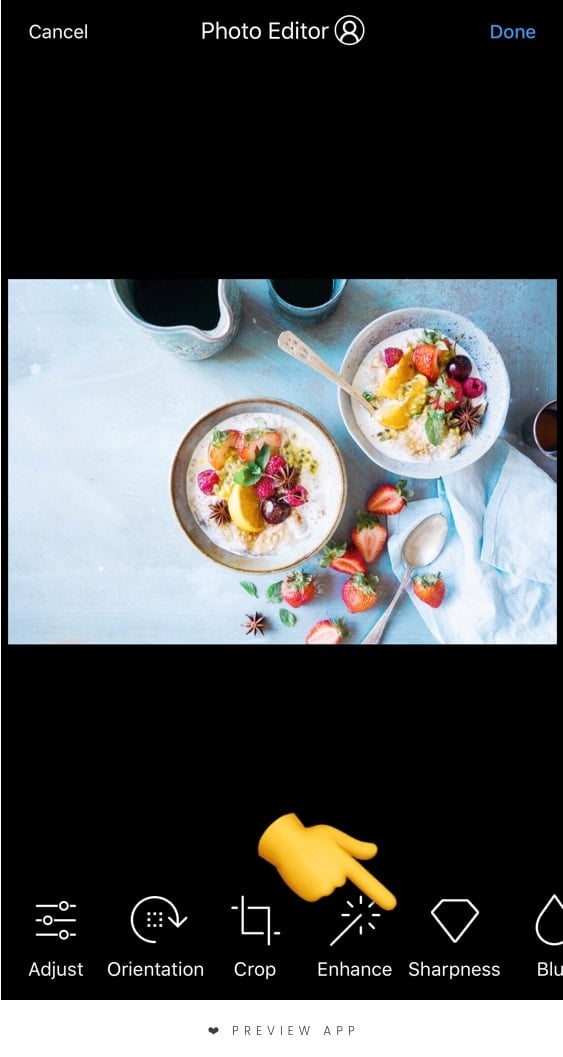
- Go in the Photo Editor of Preview
- Add a little bit of contrast
- Add a little bit of sharpness
11. Have fun
This is the secret sauce of Instagram: Have fun.
Your feed will never look the way you want if you’re not having fun.
Love what you do. Take your time to create what you want to see and share. There is no right or wrong with creativity. Have fun planning your feed!
I hope this article was helpful. Don’t hesitate to ask if you have any questions.
Until next time, see you all on Instagram!
Thanks to the thepreviewapp.com for sharing with us this article.


